Thousands of Facebook pages don’t lie.
Working in social media analytics I look at Facebook all day. This sounds great or terrible depending on your point of view. Perhaps both are true – but I don’t quite use Facebook in the way you might imagine. Of course I check my own personal news feed as regularly as anyone, but at any given time I probably have a handful of tabs open looking at the Facebook presences of different brands, media companies. radio stations, sports teams and more. Over the last year I have looked at thousands of Facebook pages, both directly and via our in-house analytics tool. This gives me a pretty interesting bird’s eye view of what trends and methods actually work in terms of engaging audiences, and of course the mistakes that brands make when it comes to posting on social media.

I’m not concerned here about what sort of content I personally like or dislike – I’m looking at the real data that reflects real behaviour. When I’m looking at a brand page directly on Facebook I will quickly observe:
- Their approximate posting frequency
- Whether they’re generating engagement
- The type of content they’re posting – links, videos, photos?
- The overall visual look of the page
This last one I do by scrolling down, fast. I don’t even really care about the details of the posts – what I’m doing is flicking quickly through the posts made by the companies to determine whether or not they have anything visually appealing on their timelines. Is there something that looks interesting enough to make me stop scrolling?

A while ago I read about the supposed 3-30-3 rule, which is approximately: If you can grab 3 seconds of someone’s attention and they are interested, they’ll read for another 30 seconds. If you can convince the reader that you have a worthwhile proposition within that time you’ve got the reader for a further 3 minutes.
If you can’t get across what you wanted in 3 minutes then you need to rethink your message.
So the question every brand needs to ask is ‘how do I make something that looks interesting enough that it makes my target audience stop scrolling?’
You have 3 primary elements to consider when making a post:
1. The Caption
This is yours, where you put the stamp of your own personality or the voice of the brand on your post. The biggest fail that many brands make here is writing too much. People don’t care. I consistently see posts that have a lot of text stuffed in here under performing compared to the potential of the page. There are exceptions, but you’re probably not an exception, especially if you’re a brand, and especially if you’re thinking “I’m probably an exception.” Don’t write in ten words what you can say in two.
2. The Image
Whether you’re uploading a photo or posting a link, this image is massively important. You can convey information about 60 times faster visually compared to text. You know those popular viral posts that have some supposedly motivational message or perceived wisdom plonked over the top? There’s a reason you see them all over your newsfeed and never see any text only ones. Same information, different delivery method. A good example of this image & text combination will have the image give immediate context to the text – see pretty much every meme pic ever.

When it comes to regular images there is a clear trend over Facebook – authenticity. An image no longer has to be good in the classical sense. It doesn’t have to be a good photograph at all, it just has to be believable in context. What does that mean? It means most of the time people don’t care about polished images that they expect in other media channels, they want something that goes deeper and shows them something personal. I’ll give one quick example with clothing label A.P.C. When they post images that are obviously marketing shots, they get less engagement than pretty much anything else they post.
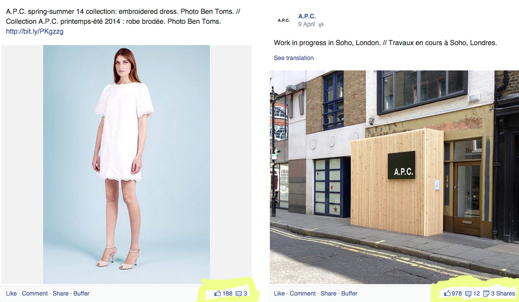
A phone camera shot of what is essentially a boarded up building is much more interesting to fans on Facebook than images they can see in other places.
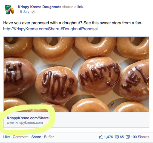
One more example – here from Krispy Kreme doughnuts. The image is pretty good, perhaps the execution could be better but it isn’t a bad try and might well grab your attention for the fabled 3 seconds. The caption backs up the image and vice versa. Where this post falls down is the headline and the intro, which is the next element.
3. The Headline & Intro
When you’re posting links that render natively on Facebook (as pictured above), both the headline and strap-line or intro line are important yet often overlooked. You should be posting these types of links should be more often given Facebook’s recent changes that favour native links over photos which have a link buried in the caption text. Unfortunately in the example above where I’ve highlighted, Krispy Kreme doesn’t even have a headline – simply a URL which is redundant as Facebook will automatically place one of these underneath your headline.
What you’re looking for here is for the main headline on the link to give you information about where you’re clicking through to. By doing this you’re reducing the ‘leap of faith’ that users make every single time they click away from Facebook.
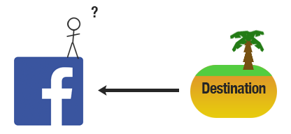
Your headline and intro line should make this leap as short and safe as possible. You’ve likely witnessed clickbait type headlines that indicate there is something worth looking at at the end of the click rainbow, perhaps against your better judgement you’ve clicked such a link and ended up at a misleading article that isn’t about what you thought it would be. Facebook users wise up to this sort of tactic quickly and it erodes trust in your audience that is extremely difficult to earn back. Indeed, Facebook has recently announced it wants you to spend longer away when you click-through to another site – they consider this an indicator of worthwhile content on the other side.
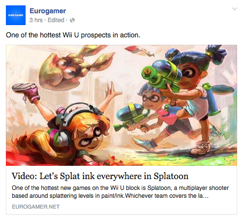
Make your headline honest, consider what you’re saying in the intro line. Don’t fall into the clickbait “You’ll never guess what happened next…” style. If the proposition is interesting to the user, they will click (and these are the clicks you want). Eurogamer’s example below will not appeal to everyone, but it’s clear in the value proposition it’s making and a good example of giving a user accurate and realistic expectations using all three elements.
Aside from content – which is the king of everything, these are the 3 most important elements to consider when posting on Facebook. If you have really terrible content then having the best formatted posts isn’t going to magically turn that content into gold. On the other hand you could and probably do have some really interesting content which isn’t achieving the reach it deserves because you’re not giving it the best chance to be noticed.
Bonus: The advantage of video
Finally, there is one area I’ll mention quickly here which is video. Nothing grabs Facebook users’ attention more than autoplaying video. The vast majority of people don’t turn this option off either. The production barrier to decent video content (while still high) is lower than ever before. At the moment Facebook heavily favours video uploaded natively in terms of reach. You might want to direct people to your company YouTube page, that’s great – do it by uploading a 15-30 second teaser direct to Facebook and including a link to the full video.

Thanks for reading!
-Steve